
Color Theory
Here, we’ll cover basic color theory. I will give you common understandings of color from books, or the web. Then, we will go over my own understanding and feeling, which in turn will help you to shape and form your own understanding.
One thing to know, is that color association varies widely from culture to culture and individual to individual. The following are broad understandings as well as natural bodily reactions.
Table Of Contents
Section 1.
Color, color, color…
RED
Naturally stimulates a faster heart rate and an increased respiratory rate. Red is the color of both love and rage. Red can signify ambition and leadership as well. Often used as an accent color by designers because it’s sure to grab attention.
ORANGE
Associated with fall, pleasure, and the fruit that shares it’s name. Due to that last association, orange is widely linked with health and wellness. Often a color of stimulation, optimism, and vibrance.
YELLOW
A dynamic color. Yellow is associated with happiness and liveliness, as well as caution and danger. Yellow is the color of the sun. It has been studied that babies will cry more in yellow rooms, and people will lose their tempers more in such a room. The most difficult color for the eye to take in, use sparingly.
GREEN
Very dynamic in it’s uses. Associated with life and ambition; as well as jealousy and envy. In contrast to yellow, is the easiest color for the eye to take in and is therefore relaxing. Associated with wealth, renewal, and nature.
BLUE
Has the opposite effect of red. Causing a calming effect and lowering blood pressure. Associated with depth and knowledge, as well as sadness and depression. Symbolizes loyalty, peacefulness, strength.
PURPLE (VIOLET)
One of the rarest colors in nature, so it can seem artificial. Associated with wealth, luxury, sophistication, romance; as well as gloom and frustration.
Color As It Is Known
Section 1.5.
Advancing & Receding Colors
In art, there is a concept of advancing and receding colors.
Cool Colors - Such as green, blue, and purple will appear farther in art, or seem like they are getting farther from you. This is why they are called receding colors.
Warm Colors - Such as red, orange, and yellow will appear closer in art, or like they are coming toward you. This is why they are called advancing colors.
There is a lot more to this phenomena in art. I will give you references at the end for your own studies if you’d like. This base understanding I feel is the most important though.
Section 2.
Color As I Know It
My personal thoughts on color:
It’s important to note the importance of hue. Pink is a different hue of red and is one of the most romantic colors. Just as gold is a hue of yellow. Different hues within these colors will have different associations and I urge you to learn the more common ones.
I have also included what chakras these colors are associated with, as understanding how the colors and their meanings match up with the Chakras and their meanings has been an informative and useful tool in my photographic storytelling.
RED
Red. The color of vigor. The color of blood, as well as stop lights. Stop signs and ambition. A dynamic color, sure to grab attention. Although its complementary color is green, I believe it can be balanced out with blue. Red vs. Blue has been popularized in the modern age through games and various pop culture things. Think ‘The Matrix’. I find that using blue and red as opposites works when balancing a composition or creating a juxtaposition. Red is associated with the Root Chakra.
ORANGE
Orange. An interesting color. It complements blue, and the orange/teal combination is one of the most popular in the film industry. Orange is associated with the Sacral Chakra.
YELLOW
Yellow. A dynamic color. Associated with happiness and excitement. Purple is it’s complementary color. Harmonizes well with blue. Yellow is associated with the Solar Plexus Chakra.
GREEN
The most abundant color in the natural world. Red is its complementary color. The combination is closely associated with Christmas in the United States. Purple and green create a good harmony. Green is associated with the Heart Chakra.
BLUE
Blue. I associate blue a lot with sadness. I also think of the ocean and it’s depths. As stated above I feel that red and blue have become opposing colors in pop culture today and can be used accordingly. Probably one of the most abundant colors you will run into as an outdoor photographer as blue is always present in the sky. Blue’s complementary color is orange. Blue is associated with the Throat Chakra.
PURPLE (VIOLET)
Purple. The color of mystery. The color of wealth and love. I have found that purple is polarizing. Some people like it and others hate it. Use sparingly. Complementary color is yellow and harmonizes well with green. Purple is associated with the Third Eye Chakra.
In this section I will analyze the color theory in my own photos in order to give you insight as to why I compose photos a certain way, how you can improve your colors through post processing, and why color is so important. This may help you to form or hone your own methods.
I believe that color is a hugely important part to the composition of any photo. Some people believe that practicing in black and white will help to improve your composition. I believe that is backwards. In today’s digital age, color and photo manipulation are on the rise. I am a ‘purist’ photographer. I do not use photoshop to add any elements not originally present in the photo. However, I am not against enhancing the colors in photographs. I believe leveraging the digital age to create provoking photos will lead us to a new playground in photography. It will lead us to seeing the world in new and beautiful ways.
So, without further delay. Let’s learn, digital traveler.
Section 3.
Color Theory In Practice

Simple and basic. Blue and Orange are complementary colors. This took little to no thought for me, as I was given this beautiful sunset by the world. A good balance of complementary colors. The colors have been changed slightly in post but it’s a simple shot.

Another simple shot, this is moss on top of a small brick wall. I have increased the luminance, saturation, and changed the hue of the green to hold your eye. I have added purple to the shadows via tone curve and tint. The addition is subtle but you can definitely see it if you are used to looking at photos and color. The purpose of adding this purple to the shadows is to create a harmonious composition for the green moss. Green and purple are complementary colors. The addition of purple creates a sense of ease in the photo — harmony.

Same photo without the balancing purple tint and tone curve.

Same shot with no color manipulation.

Here, the blue bag is the brightest point in the photo. This is balanced well by its complementary color - orange. Which is present in the canopy of the street hut that our subject has passed by.
Blue is a receding color which gives the subject a sense of being farther than she is; while orange is an advancing color, making the hut appear closer than it is. This creates an interesting effect down the walkway.
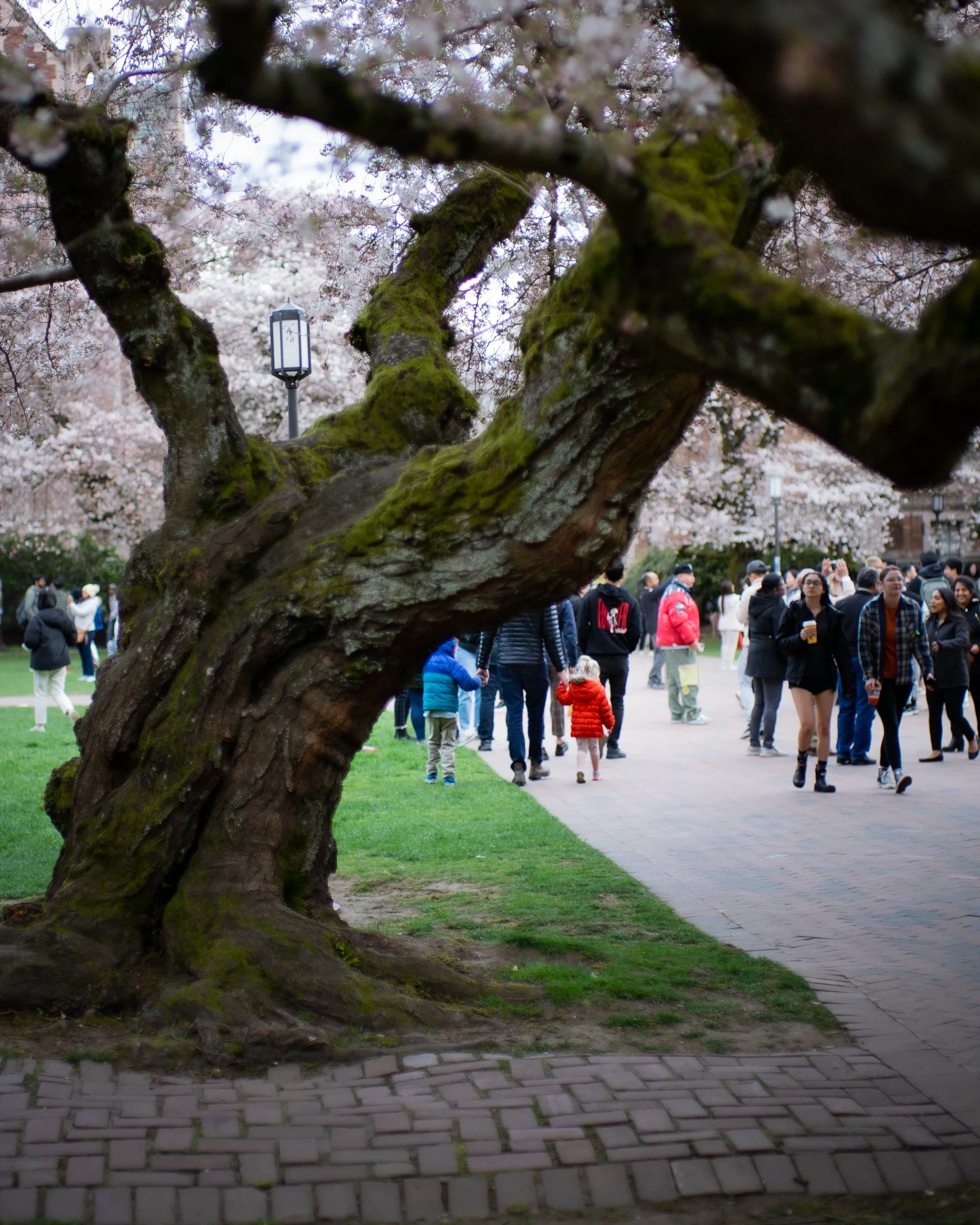
The pink petals of the tree are an added bonus. Pink being a caring and gentle color, gives the photo a sense of lightness.
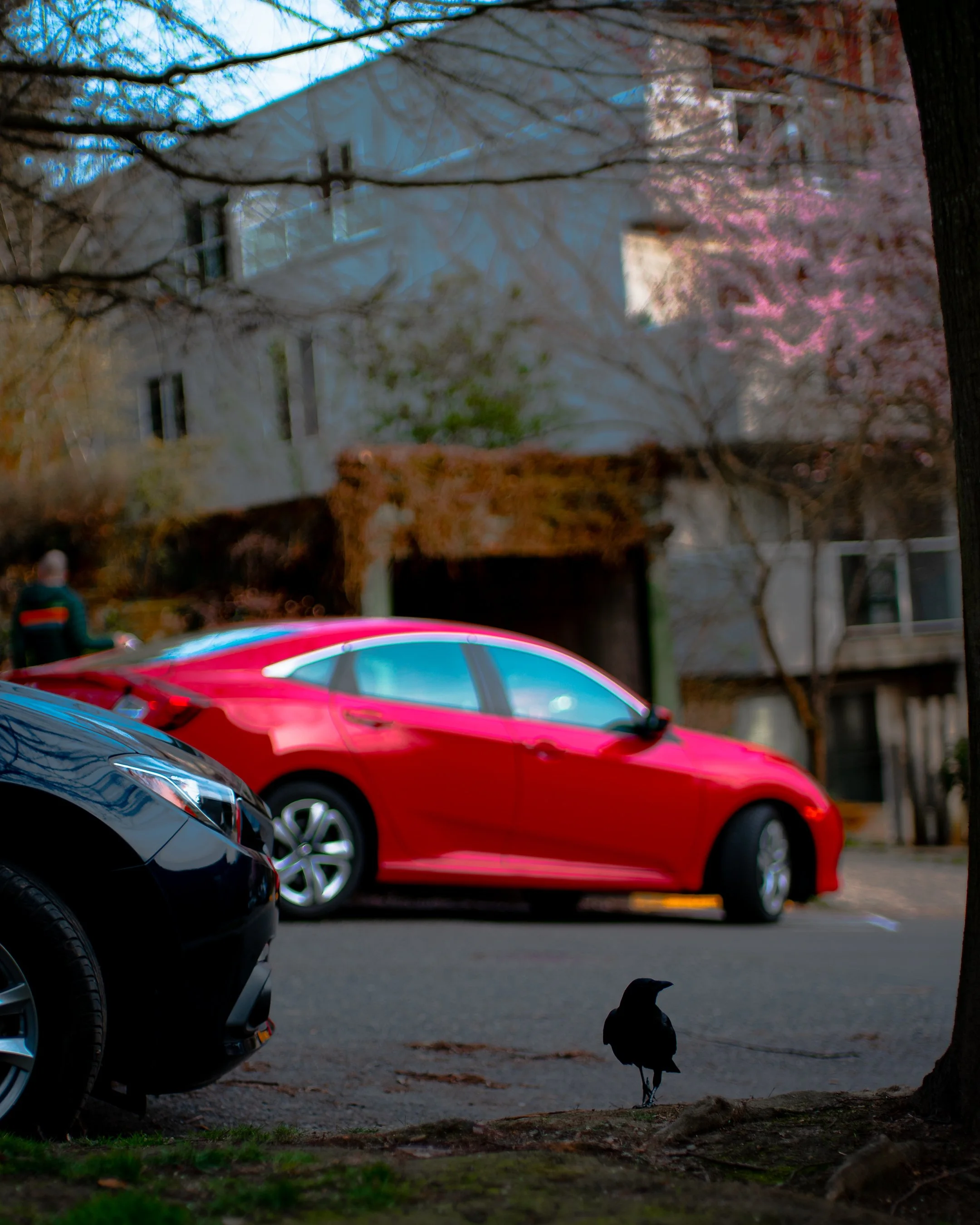
Here, you get hit with the bright red of the car.
By having such a heavy hitting color in the center of the composition the eye is drawn around to different elements of the photo, but comes back to the center.

I noticed the young girl had on a red jacket and the boy had a blue jacket. I found this a great opportunity to create a juxtaposition using not only gender - but color as well. I desaturated the rest of the ground level in order to give the subjects extra pop.
The same photo without the colors desaturated. I have still increased the luminance, saturation and honed the hues of the red and blue colors. Desaturating colors is a style that I enjoy. Don’t be afraid to experiment.
In closing, this is color theory. It’s vast, it has no rules. It changes the way that you see the world. The places in which you work or visit or travel. It can take an uninteresting place - and with just the right colored car, bag, or accent, and turn it into something very interesting to look at.
In art, you can always learn more. But once you learn something, it is so hard to forget.
Keep learning my friend.
*In my opinion, Joanna Kustra is one of the contemporary artists that is well informed on color theory. She works within a studio largely and is versed using photoshop methods, as well as premeditation to create harmonious colors within her photos. You can learn a lot from her.
stay warm.
dc