
(ii) Week 1 -Balance
Welcome to round 2 of composition exercise. There will be less covering of what you should know about composition here, and more analytical review of my photographs..

Employing use of negative space with a focus on the top rule of thirds line. (Give or take). Interesting lighting carries this. I feel that the shadows are a touch too cold, maybe go into tone curve and bring that up a bit. Even out the colors and this is an interesting photo. There are sun rays that are barely visible but became more pronounced with different edits. Would like to figure out how to exacerbate and highlight those sun rays. A decent photo, but I like to keep away from sky pictures, as I am not always the artist in photos of the sky.
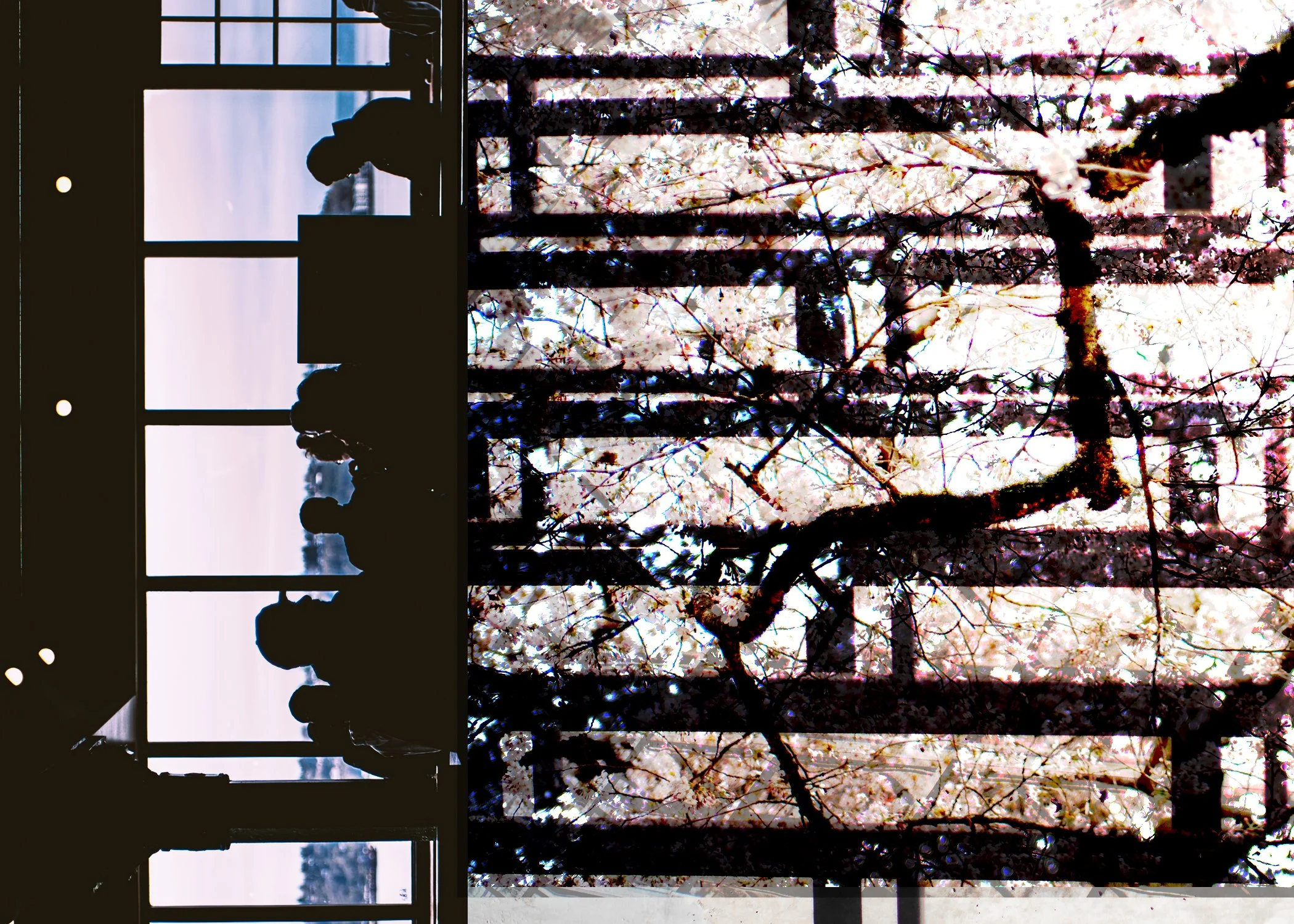
I enjoy making composites. As I didn’t shoot a lot this week, lets see what makes this one work. The right two thirds are very bright which plays well to the left third being dark. We also have lines in the various photos that come together that are flat, which creates a sense of rest. I should have leveled out the photo on the underneath layer to make it completely flat on the right side, looking at it now, it has some tilt. The line on the right that isn’t uniform with the rest leads you to the people. Which are sideways. My friend hated it oriented that way. But sometimes our friends have opinions about our art that doesn’t matter too much, because I like it this way. I believe the dark and cool mood of the left third is well balanced by the light and warm mood of the right two thirds. For me, this composite works and is well balanced, even if it does make you tilt your head a bit haha.
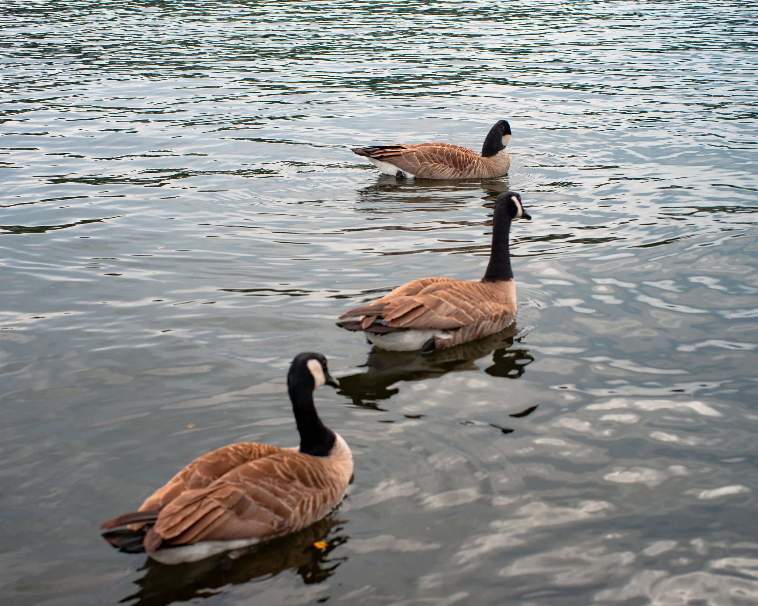
Utilizing the rule of odds, filling the frame, and left to right rule I feel that this is a well balanced photo. I think some post processing mix of the colors adding more contrast could really make this photo better than it currently is.

This one is fun. For an engagement party I did at my work. Adding interest in the foreground via fish. Balance feels a little heavy to the right side. Could perhaps be evened out with a linear gradient to the left side of the photo. The lighting in this room is so hard to deal with. As you can, outside the windows is significantly brighter than the foreground. I may have left this photo a little too warm and somehow the colors are a little flat to me.