
Composition
Welcome,
This compositional exercise is intended to help refine your creative eye and to build upon the toolkit that you can draw from at any given time. I learned of this exercise from Pat Kay.
The Exercise:
Practice one composition each week. Go out and try to shoot mainly that composition.
Through constraining yourself, you oftentimes grow your creativity.

Week 1 -Balance
I began with balance. Balance at face value is creating balance within an image. You want an equal draw in opposing quadrants of the photo.
Balance is one of the most interpretable compositional techniques. You can balance with forms, colors, lighting, textures, patterns, negative space. You can balance with a lot of things. Balance is about keeping your viewer within your photo.
Here are some of my shots from balance week 1.
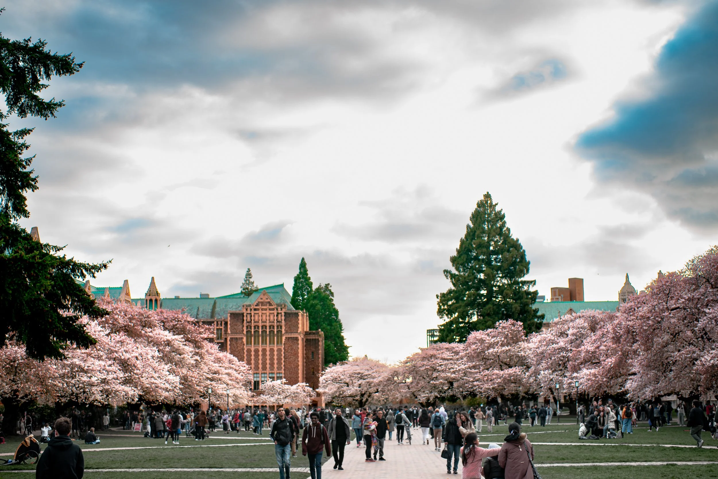
Here we balance out the complexity and crowded-ness of the bottom of the frame with the wide open sky. I like the tall evergreen tree that seems to join two separate worlds.
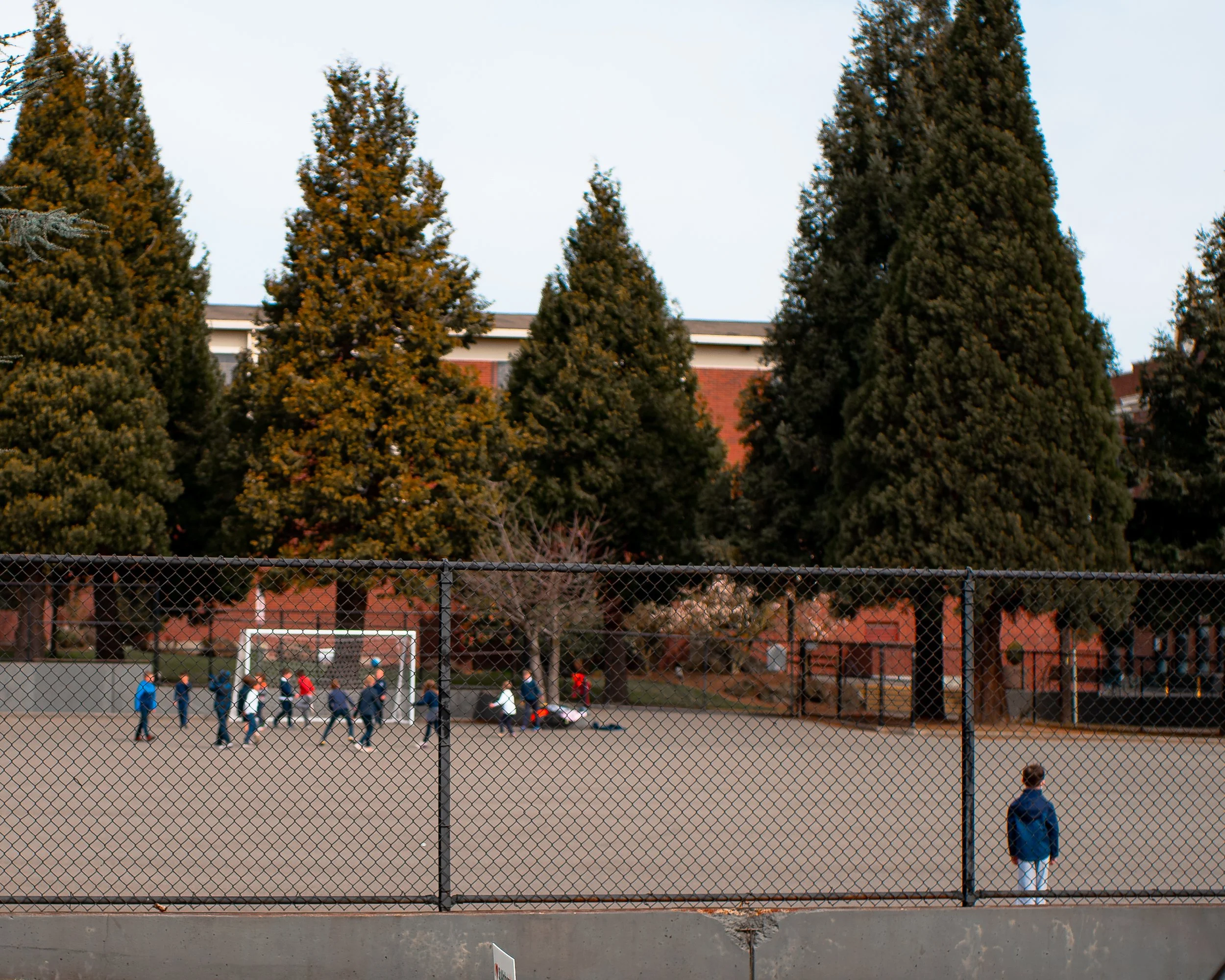
Here, the many forms in the background are balanced out by the lone form in the foreground. Even though the boy is alone, since he is closer, he carries more visual weight. This is an exploit of visual hierarchy, which I have written about in a different section of my website.
Also, balancing of left and right, resembling a seesaw is an easily recognizable way to imply balance.
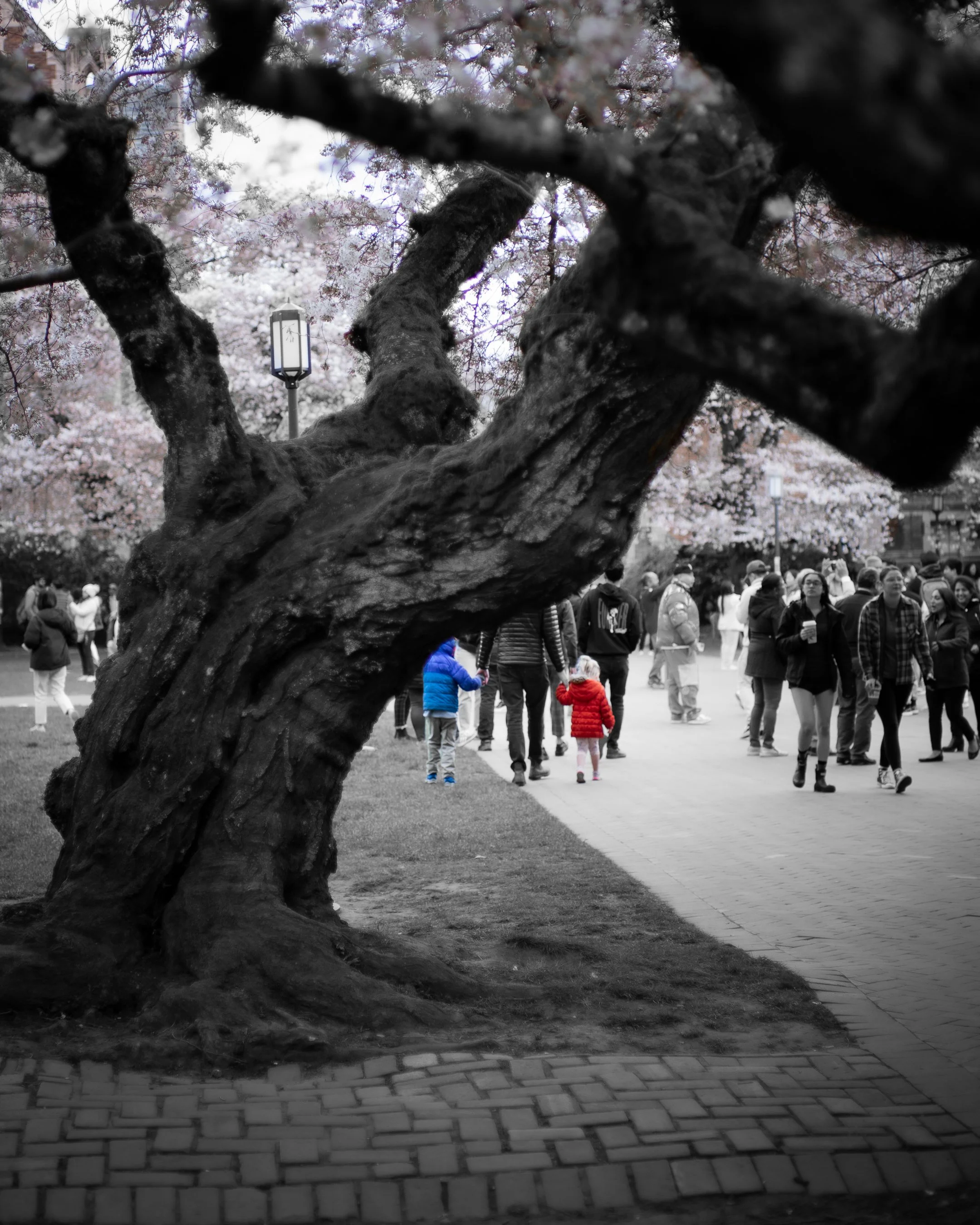
Using red and blue as opposites with a center composition. Additonally with the texture of the ground.
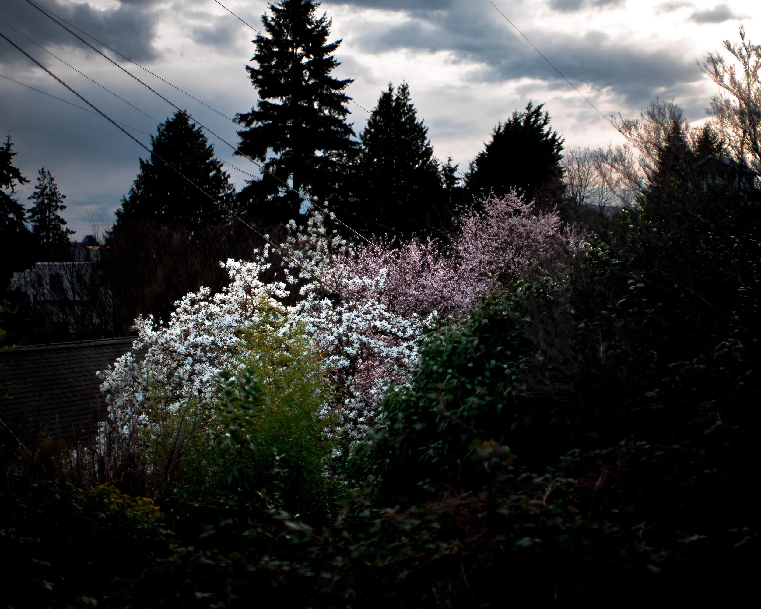
This one was interesting. Trying to balance out the dark with the light to create a good split.

A vertical form, with a centered composition. This implies balance. Though the background is complex, the subject demands enough attention to be the focus.
Week 2 -
Centered Composition / Symmetry
This is an interesting one. Centered composition is exactly that, centering your subject within your composition. While also trying to create symmetry. The easiest way to employ this is to get a reflected shot, whether that’s through water or with a mirror.
Here are my shots from week 1 Centered Composition / Symmertry.

The space needle, centered, with 2 different forms framing it.
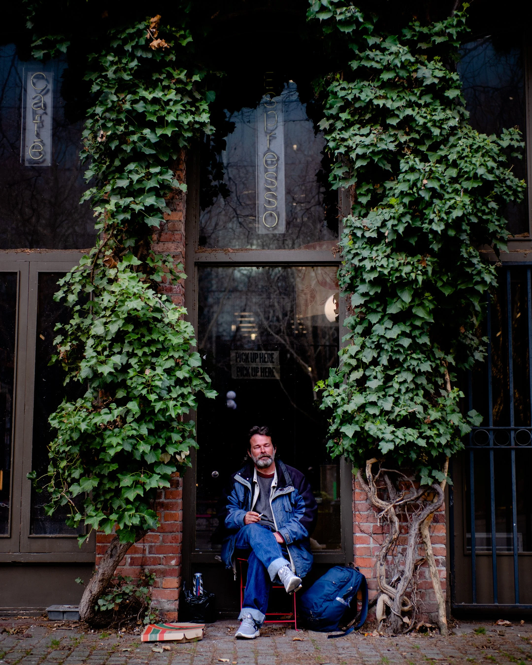
Centered composition, the man is perfectly between two pillars. Granted, the growth isn’t perfectly symmetrical - I love how this shot turned out. Seems that most things turn out asymmetrical in practice. I feel that true symmetry in the real world would create an uncanny feeling.

This one has a lot of center composition, and a lack of symmetry.
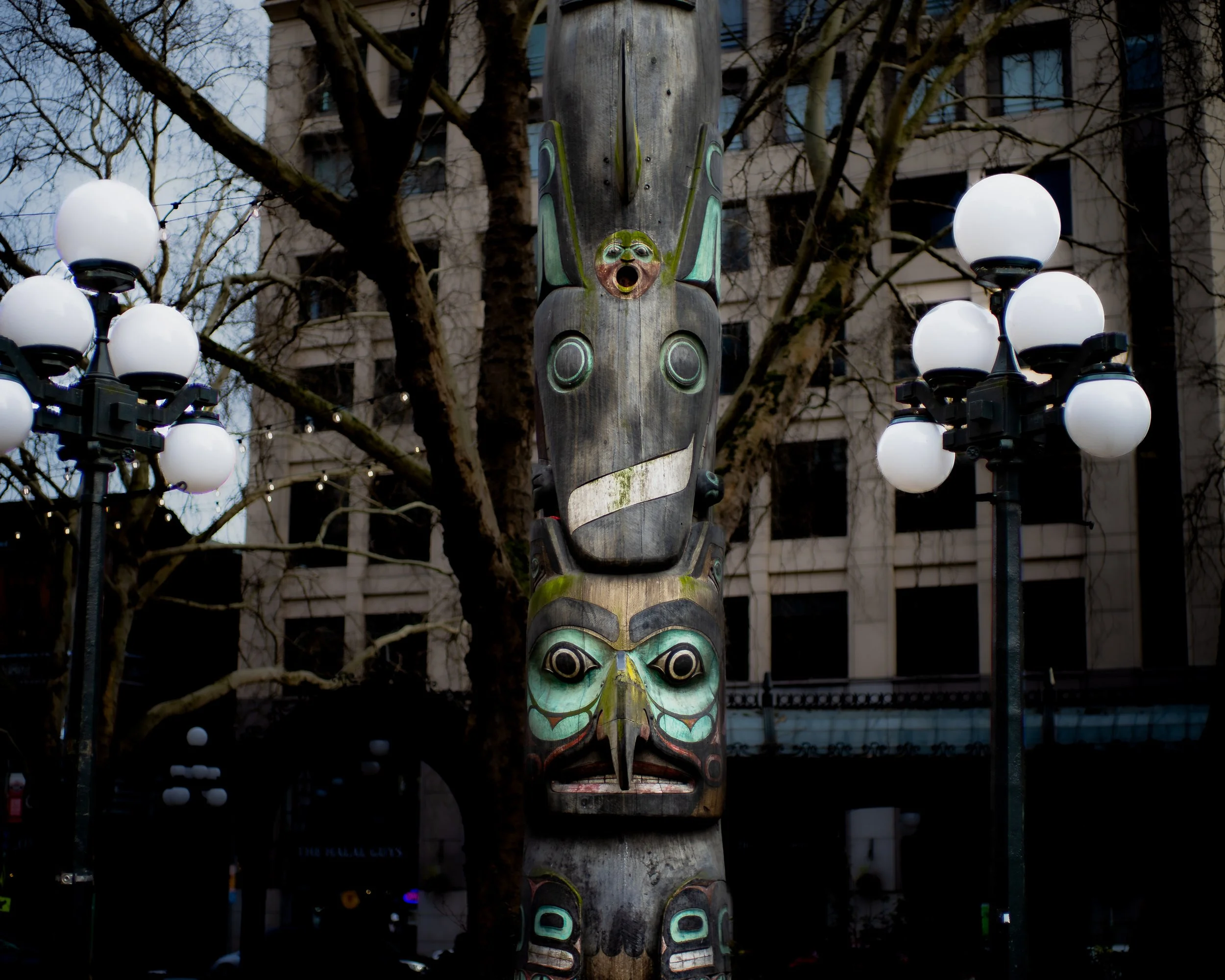
The totem pole is centered and framed by 2 symmetric lights. The angle could be improved to create true symmetry with the lights and totem pole I believe.

Ken Griffey Jr.
Creating symmetry with the banners in the background, with the statue centered.
Week 3 -
Frame Within a Frame
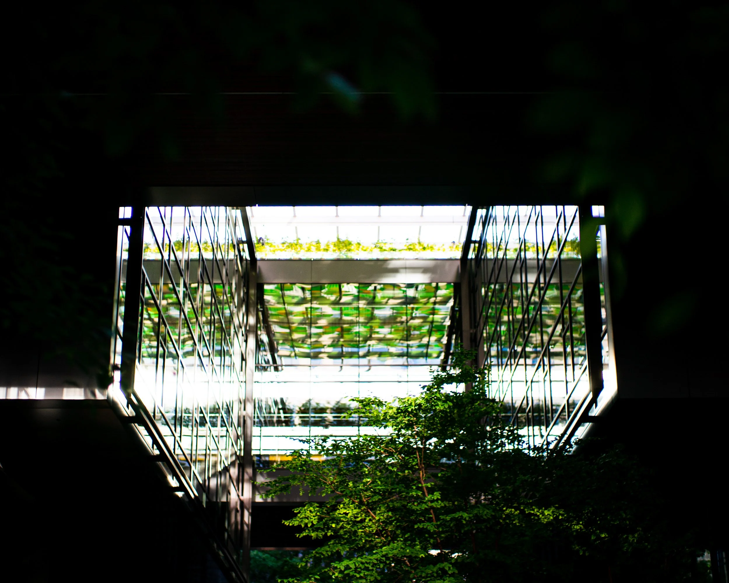
Exactly that. Shooting through a frame within the frame of your camera. This is a powerful tool to create focus, fill up more of the frame, and show depth in a photo. Your frames do not have to encapsulate the whole frame. You can shoot through gateways to the same effect.
Here are my shots from week 1 Frame within a frame:

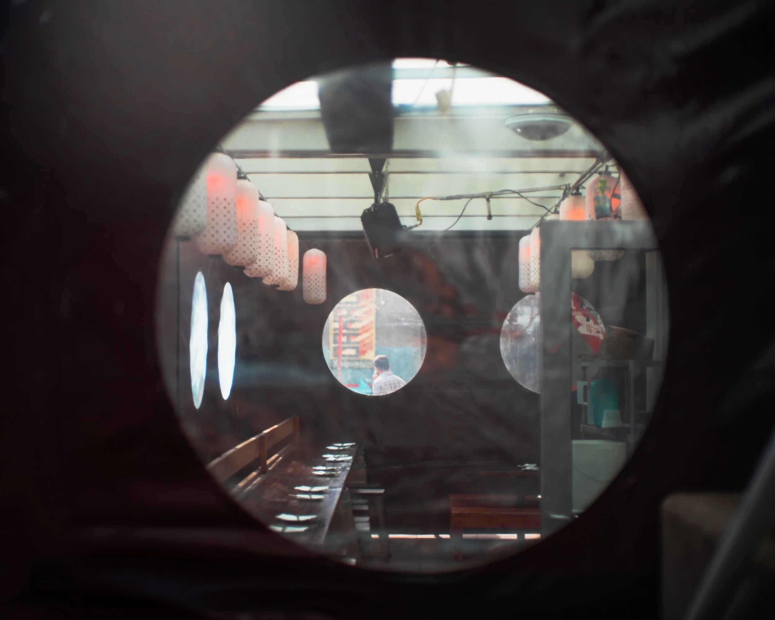
Multiple frames within the shot here. One containing the subject is an implied frame, but also the reflection of the pole serves as a boundary for the viewer’s gaze.
Can’t help but feel like I’ve seen this shot or something very similar to this shot before. Kind of an uncanny feeling for me personally…
Simple and straightforward. These types of shots are fun.

Shooting between the arm of the Jimi Hendrix statue on Capitol Hill. If you look close, there is a touch of symmetry with the reflection of the man beside her on the reflection of the glass.
A shot I’ve been looking at for a while. Double frame of subjects with interesting lighting. Framed by nature on top and bottom.
Week 4 - Simplicity / Minimalism
Simplicity. Minimalism. It’s the idea of either only capturing the subject of the photo or composing your image in such a way that nothing is distracting from the main subject. This is a very powerful and consumable composition.
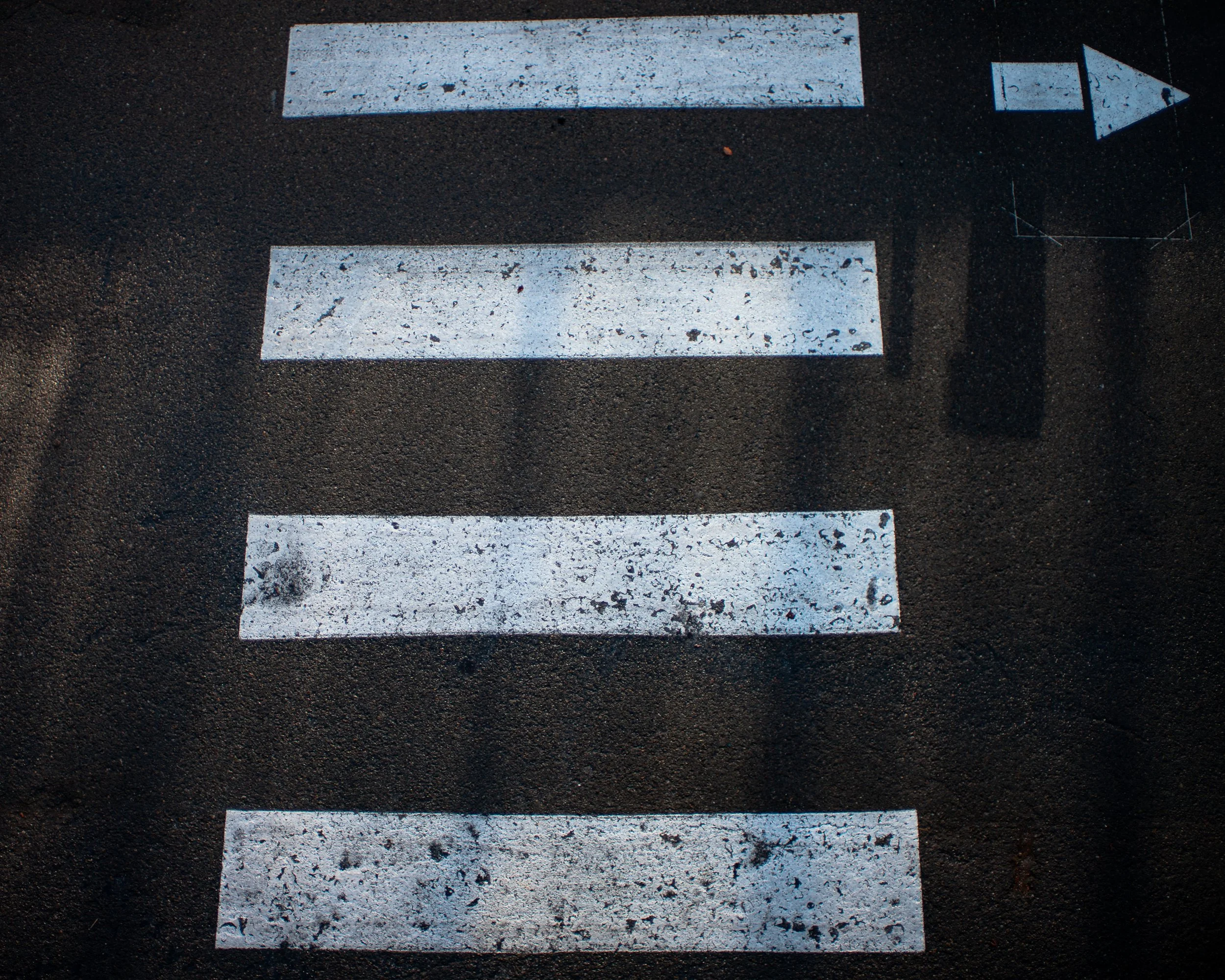
Crosswalk bars with interesting lighting.

Some beautiful lighting peaking in through a lone window.
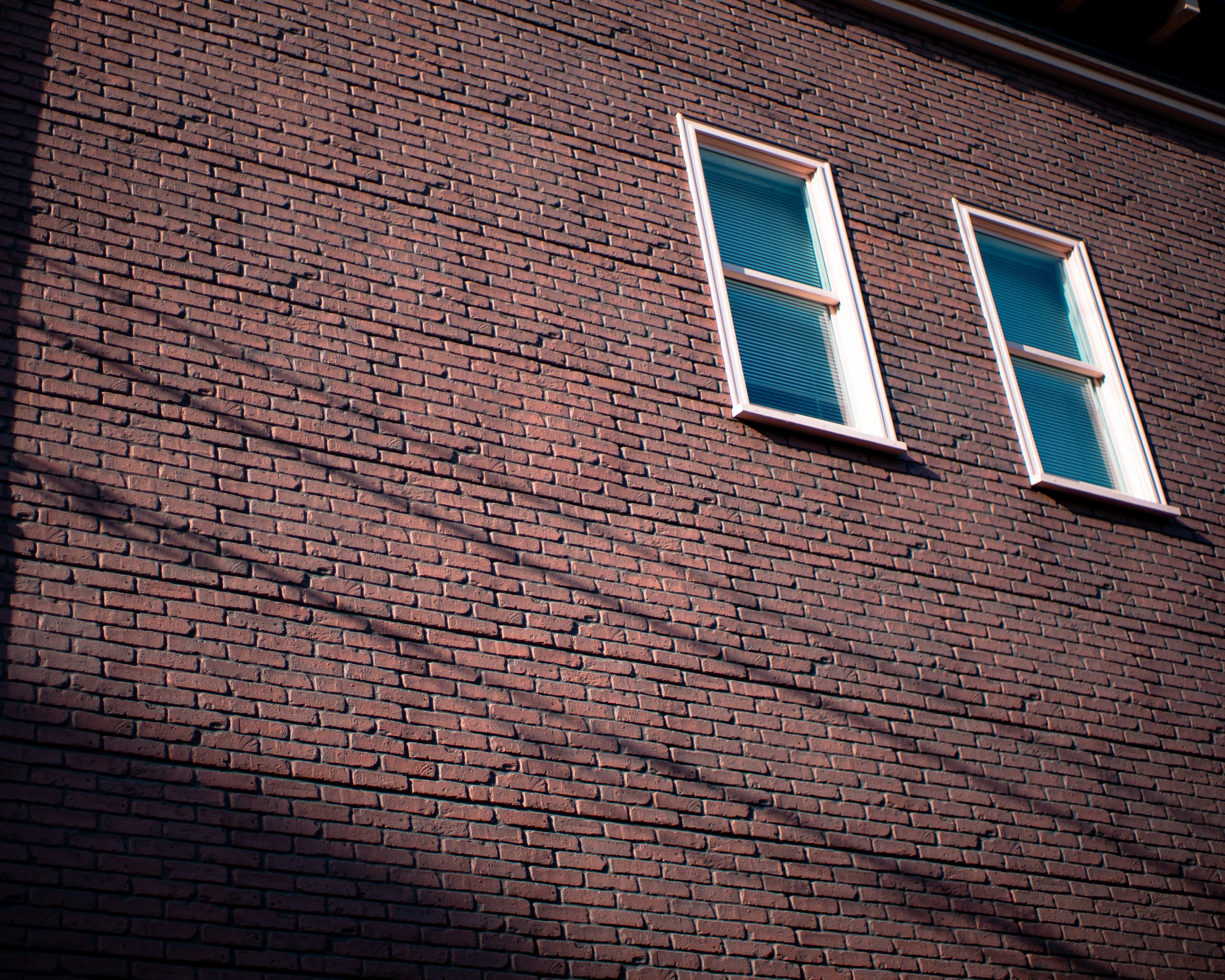
I like this one. Diagonal shadows give it a sense of movement even though it is a brick wall with 2 windows.

J’aime jouer au foot.
Week 6 -
(You Choose)
Simplicity / Minimalism
I decided to do two weeks of minimalism. Here are some of the images from week 2: Minimalism.
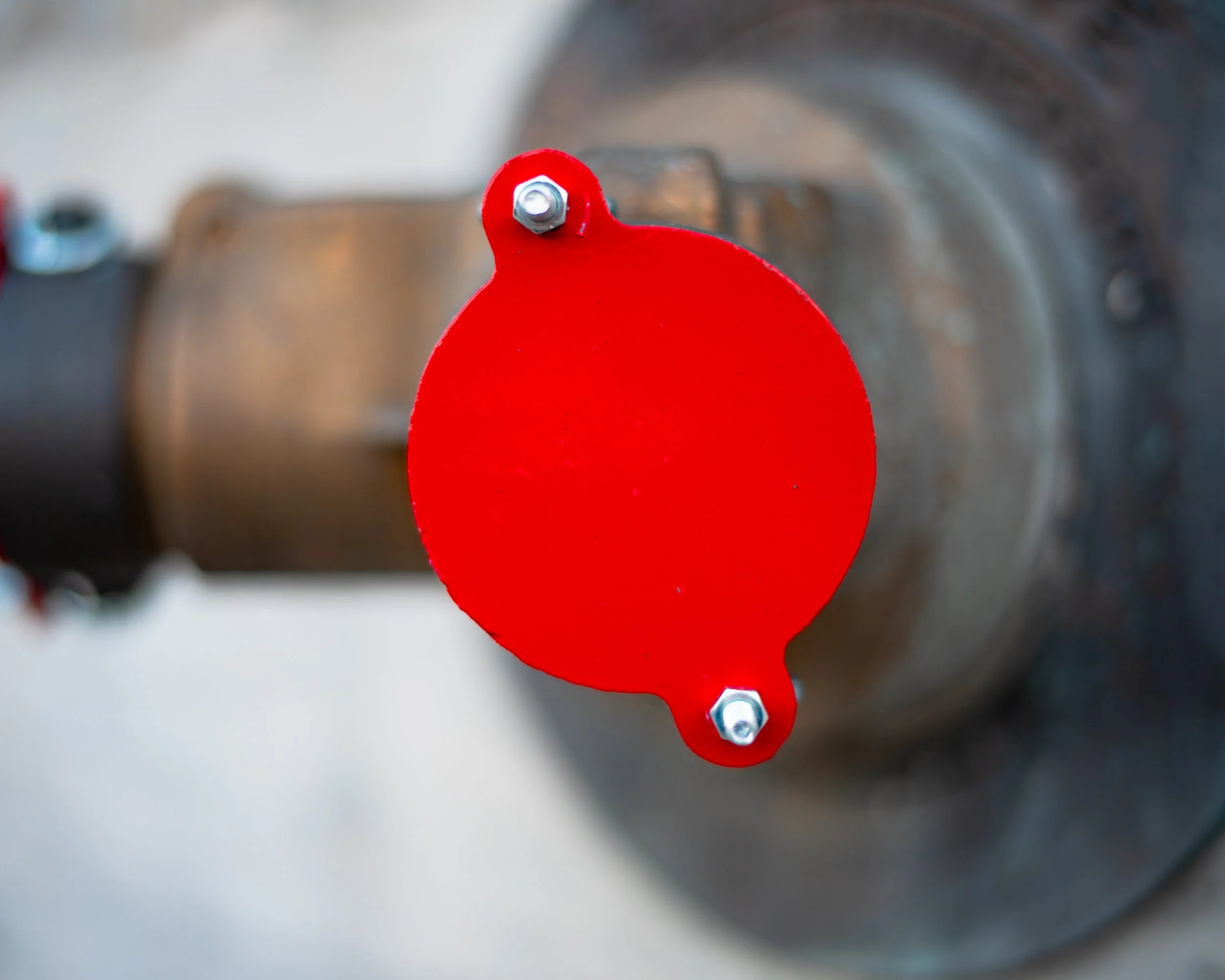
A fire hose connection.

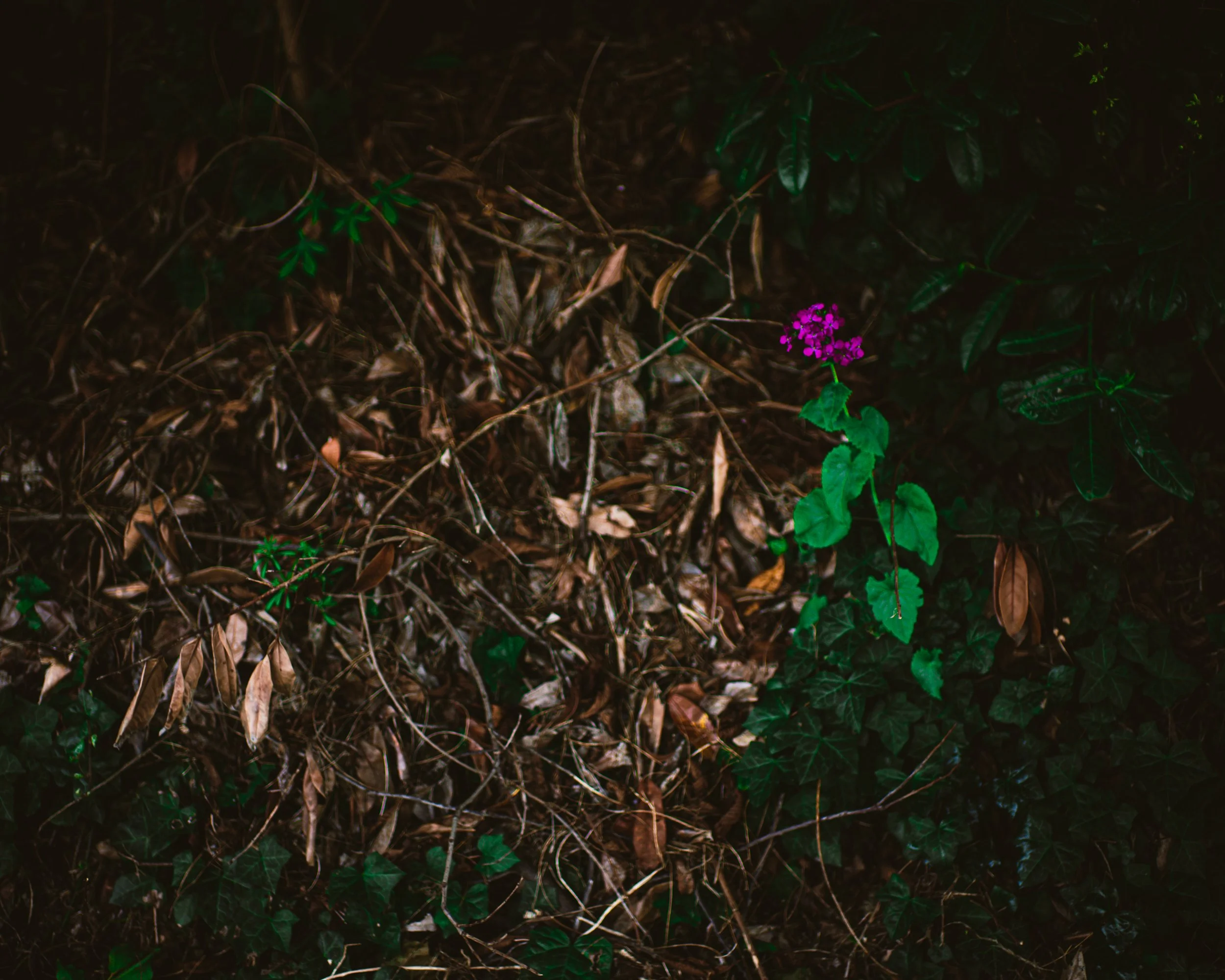
Something very calming about this one. Like a small message that life finds a way.
Complementary colors, trying to focus on making the image easy on the eyes.
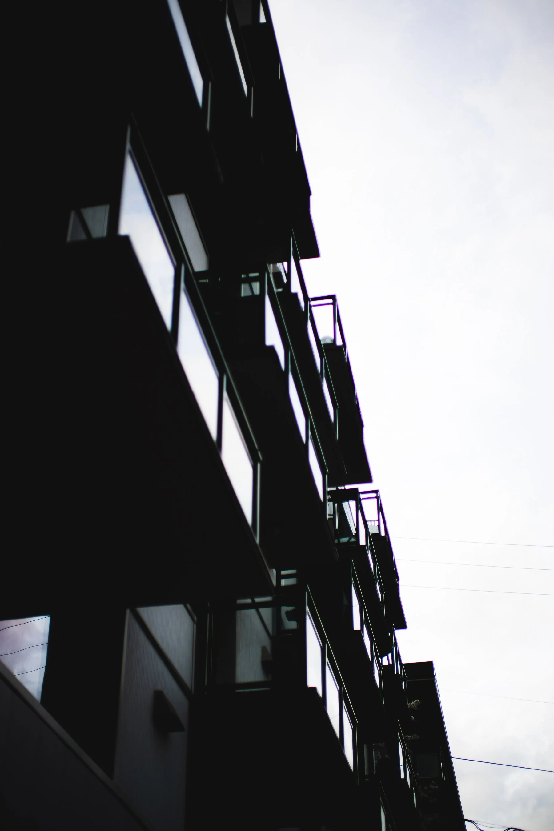
I really like this one. Just some balconies.
Week 7 -
Rule Of Odds
This one you may have not heard of before. The theory is that an odd number of subjects is easier on the eye. When there is an even number of subjects, let’s say two, the eye isn’t sure which to focus on. Having an odd number of subjects, in theory, is easier on the eye than an even number for that reason. Of course, as with all ‘rules’ there are times to break them.

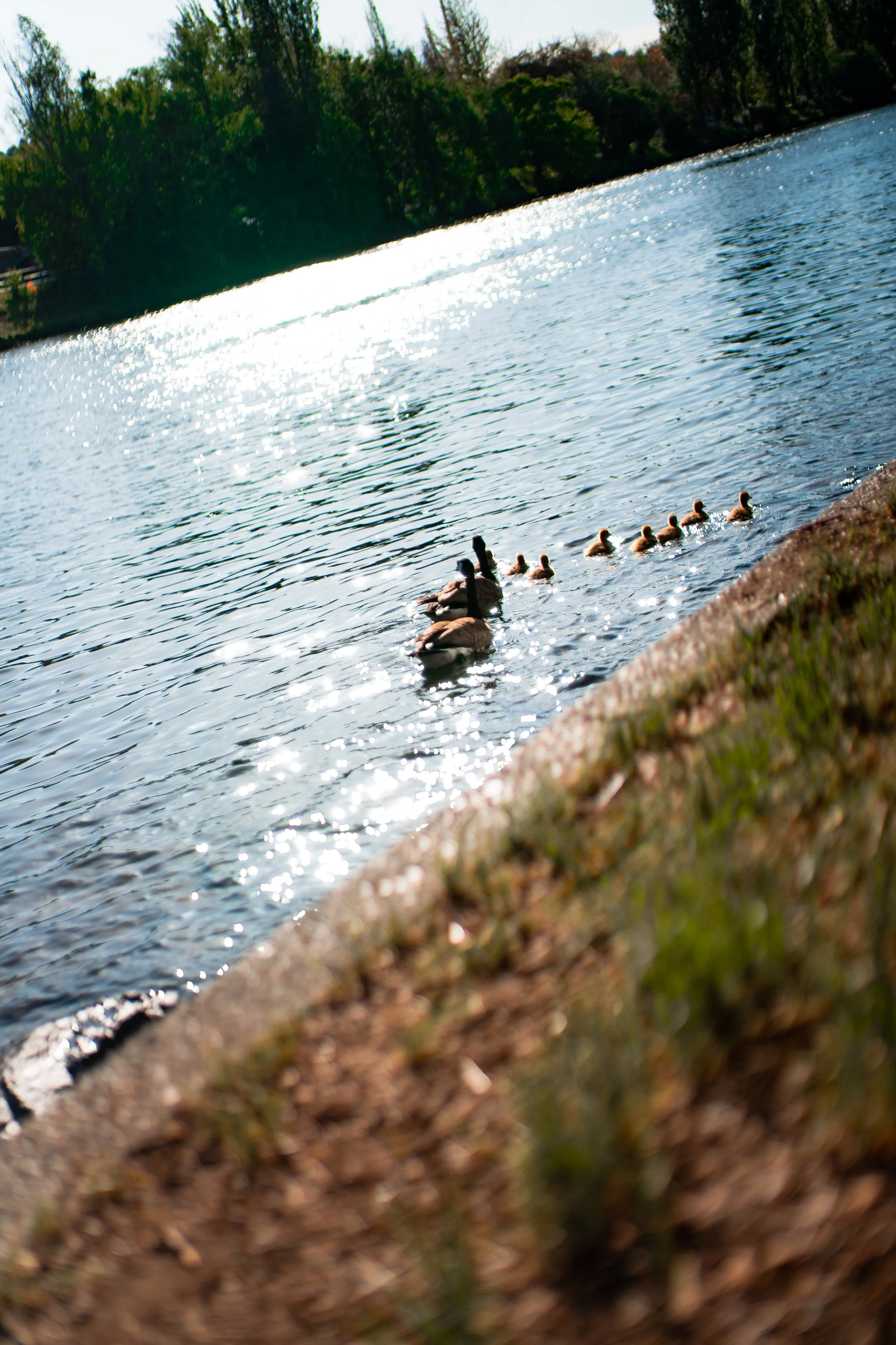
This counts as 3 point of interest to me. Maybe 5, regardless — an odd number of subjects that lead you in a line.


3 bikes shot at Gasworks Park. Whether it’s 3,5,7,9,11; having a centerpiece gives the eye somewhere to rest.
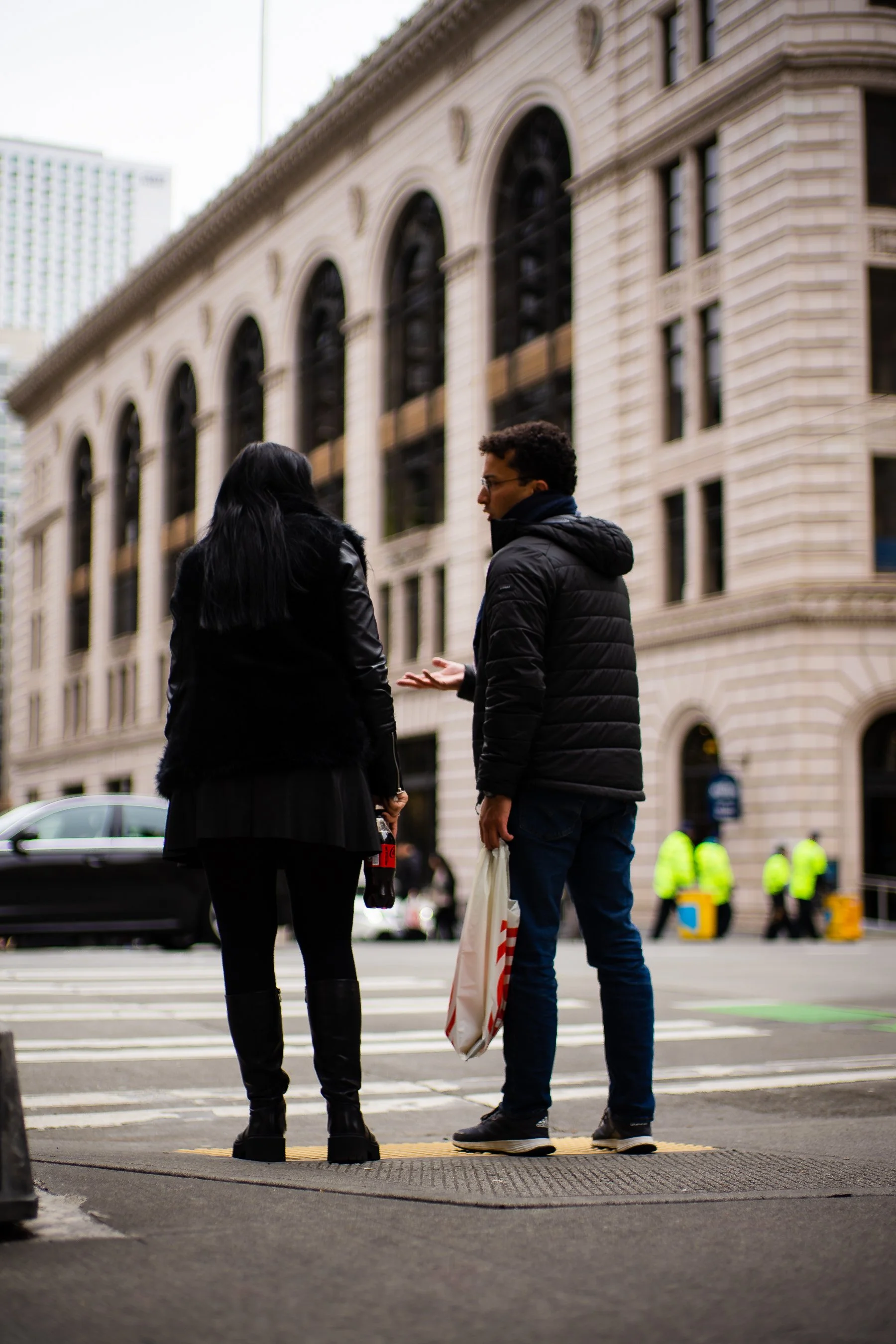
Family of three, elevated above me with the sun at their backs. Woman is making an interesting gesture and man farthest back has an interesting body position. Rule of odds.
I want to include a photo that breaks the rule. As you know couples are usually 2 people. And sometimes with the rule of odds we are playing the game of odds in the world. We work with what we have, and even with an even number of subjects you are able to find harmony in compositions.
In closing, the rules of odds is a fun compositional element. It offers insight to what you are framing or looking at. It’s something important to store in your mind.
Week 8-
Leading Lines
This week, we tackle leading lines. Leading lines in composition is the use of a line to lead the viewer either through the photo or to the subject. This makes images very clear in their intention and as such is a very powerful compositional technique for modern photographers.
I’m not sure if this qualifies as a leading line, but it does give the eye somewhere to rest close to the point of interest.

I love crows. Got fortunate with this one, the railing and side of building happen to be pointing to the animal. I don’t think every photo is meant to be perfectly level. Sometimes in life our eyes aren’t always level, so I have found that some photos feel right a little off kilter.
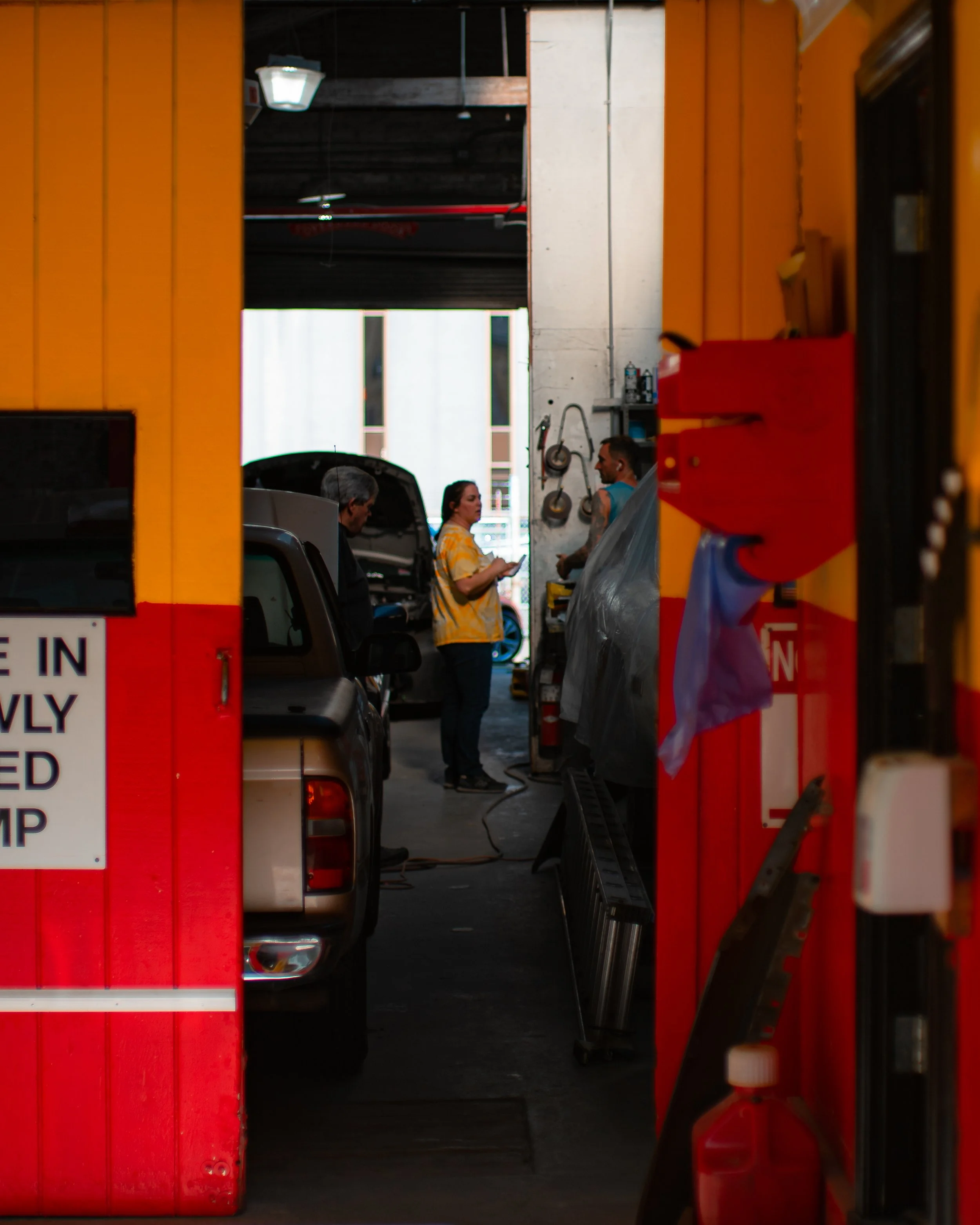
Leading lines created by two different tones of paint. The lines draw you in toward the subject, who happens to be in a yellow shirt.

Using the foreground to create a leading line.
Leading lines are one of the most important compositional techniques in my opinion. Which is probably shared by a lot of other photographers, it is such a powerful technique. Some of the lines I see people find and photograph well are incredible.
Week 9 -
(Bye Week)
I am going to take the week to let my creative eye free a bit and have a free for all when I go out to shoot again. (I suggest you do the same if you’ve been following along.)
I think one of the most important things as a photographer or any artist really is to protect your creative eye. Always find a way to tap into and stay close to what you think looks good.
With all of the information and artists available, it’s easy to get out of touch with your own vision sometimes.
Apply what you’ve learned and let yourself loose for a week.
Center composition with an uncommon shape.

The pyramid motif. Such a powerful compositional technique. Use it!
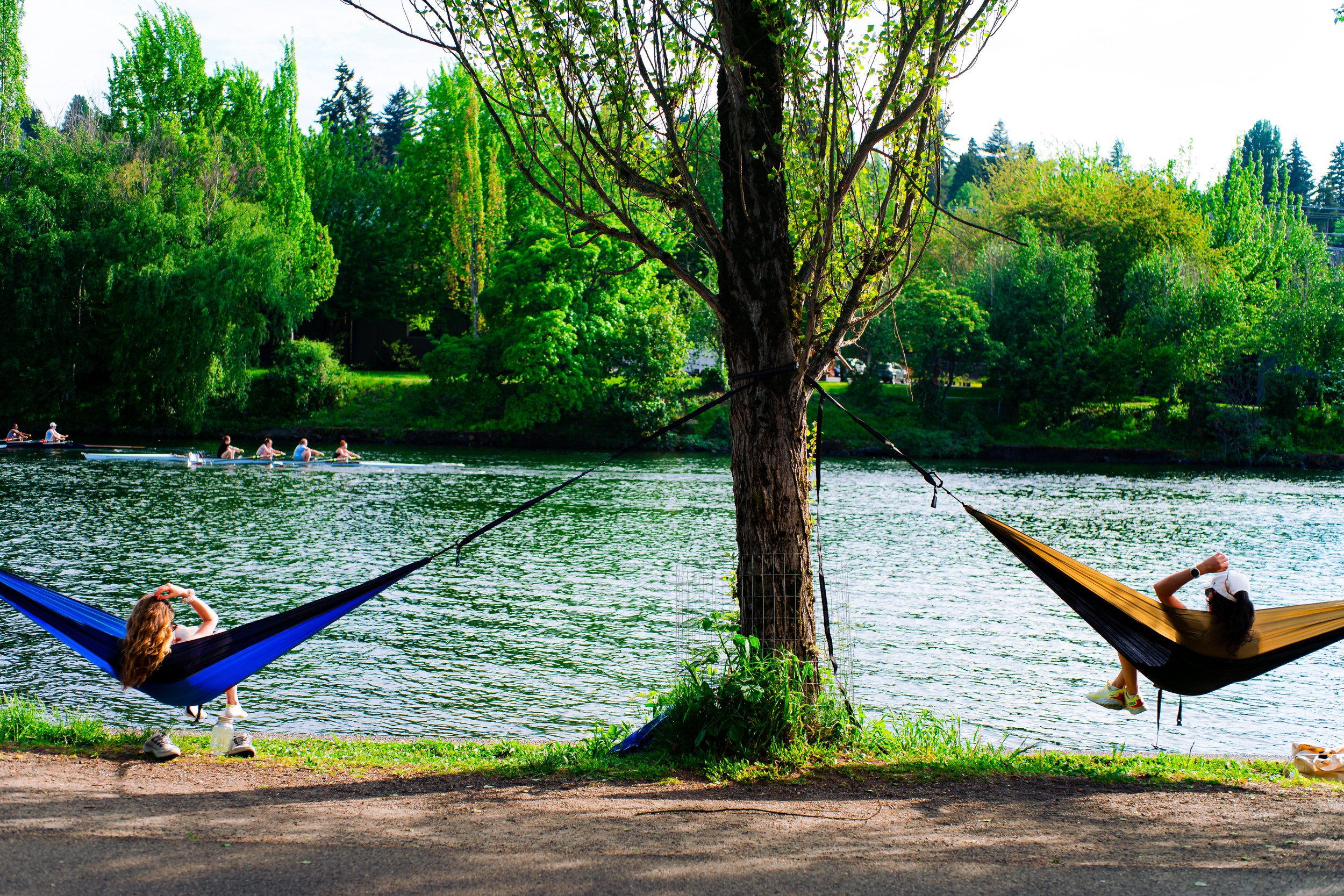
Center composition with symmetry from the girls in the hammock and some framing of the people rowing.

The line in the center leading down the alley paired with the interesting lighting/colors makes this photo pleasing.
There are more shots I have, but we will stop there and continue onto the next week. It was a lot of fun to let the constraints go for a bit and see things again. I am going to cycle these 6 compositional techniques. Continue the exercise here.